How to see and paint colour
Would you be interested in learning how to “see’ colour more? To see the grey that is really a violet or a green. Colour is so evocative and although you can feel your way into learning about colour, there are some practical ways of studying it too. Read on and try out some of these ideas.
The first thing, is to learn how to ‘see’ tones within colour. Different tones help aspects of an image to recede or pop.
Try this to start seeing tones…
Start off by learning about tonal values; how light or dark a colour is. I would say this is the number one thing I point out to people when they are having difficulty with a painting.
The easiest way to see this initially, is by taking a photograph in colour, and to then change the setting to black and white. Then value the different tones on a scale of one to ten. One being the whitest white there is and ten being jet black. Often what we think is a one is actually a two or three. You can hold a greyscale up next to the image to help you.
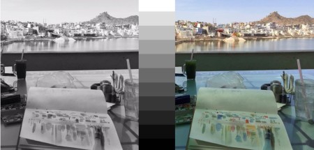
Then hold your greyscale up next to the colour photo and try again.
Go to your hardware shop and get some paint colour charts and practice ‘seeing’ with a greyscale next to the tones of colour.
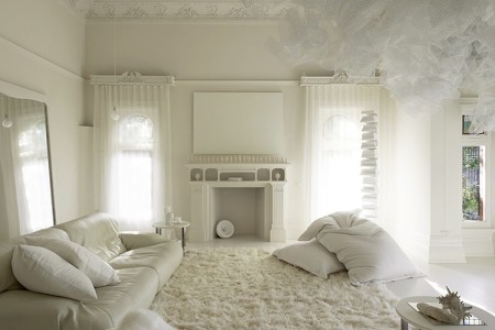
The best way to practice seeing tonal value, is to start with a painting or drawing that is white on white. You could start with just white mixed with black as your palette. I have the benefit of being short-sighted and take my glasses off when I draw, so that all I can see are the different blurry values rather than all the details. Just squint if you have perfect eyesight.
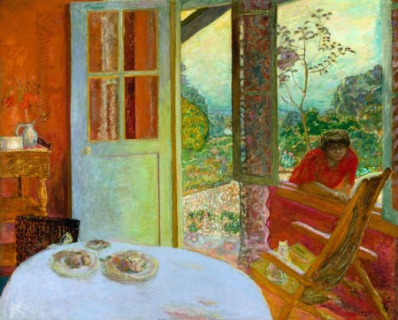
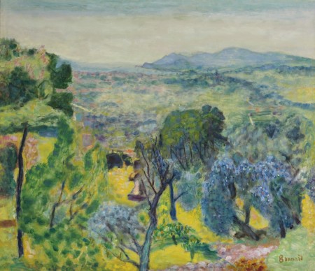
Then move onto creating whites and greys with different colours as grey can be many subtle colours. I love the different shades and tones of white in this Bonnard painting; the warmth of the outside reflected on some of the door as it transitions into the cool blues, greys and violets of the interior shade.
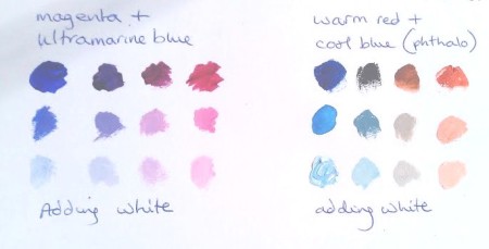
Grey can be made up with white, yellow, red and blue. Of course it is the amount of each colour that you mix in, that determines whether you end up with grey mauve brown or silver blue. Some violets as below are beautiful cool grey/whites too.
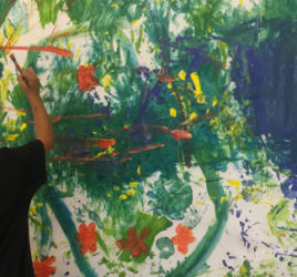
The main thing is to just start looking and doing little sketches.Pastels are easier to practice with when you are first looking at colour and want to try and match it without learning how to mix it. You can try mixing your pastel colours by layering them.
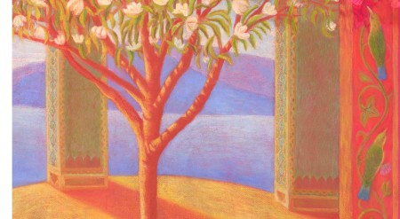
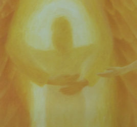
I drew this pastel on a paper painted with red and magenta acrylic because I wanted the whole piece to glow. The base colour also helped to create the violets I wanted by drawing with the blue pastels on top of the red.
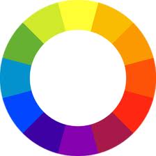 Carry some pastels and your grey scale and a colour wheel around with you and start trying to match the colours. Is it a red moving towards a purple or a red towards a yellow? Is it a green moving towards a blue or towards a yellow? Then how light or dark is the colour on a scale of one to ten? Put all your focus on the colour and the tone of the colour.
Notice why a colour is popping. How much is it because of the greater contrast in light next to it, or,the complementary colour by its side.
Creating depth with colour
One way of creating depth with colour is to have your lighter tones in the distance with little difference between the tonal values. The greater the contrasts between your colours and shades the more they will move towards you.
The greater the proximity of complementary colours the brighter the colours will become and so move towards you.
All colour reflects the colour of the atmospheric light.
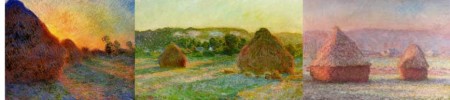
Try drawing or painting the same thing in different lights. Monet loved to do this. You will teach yourself so much about colour with this and you will start to see the subtle colours more easily.
So go and play. If you practice every day with colour, even for half an hour, you will be seeing and expressing it so much more, even within a week, and then you will become a colour addict too.
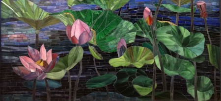
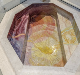
This is my most recent colour journey in a stained glass mosaic.
If you would like to learn more about seeing and painting colour you are welcome to join me on this intensive 7 week evening course.